6.20学习:
Numpy中的比较和Fancy Indexing Funcy Indexing import numpy as npx = np.arange(16 ) x
输出:array([ 0, 1, 2, 3, 4, 5, 6, 7, 8, 9, 10, 11, 12, 13, 14, 15])。
那如果想访问3、5、8怎么办呢?
输出:array([3, 5, 8])。
ind = np.array([[0 ,2 ], [1 ,3 ]]) x[ind]
输出:array([[0, 2],
输出:array([[ 0, 1, 2, 3],
row = np.array([0 , 1 , 2 ]) col = np.array([1 , 2 , 3 ]) X[row,col]
输出:array([ 1, 6, 11])。
col = [True , False , True , True ] X[1 :3 ,col]
输出:array([[ 4, 6, 7],
Numpy.array比较 x:array([ 0, 1, 2, 3, 4, 5, 6, 7, 8, 9, 10, 11, 12, 13, 14, 15])。
输出:array([ True, True, True, False, False, False, False, False, False, False, False, False, False, False, False, False])。
输出:array([False, False, False, False, True, False, False, False, False, False, False, False, False, False, False, False])。
可以利用比较符来判断array中有多少个小于3的数字。
np.sum (x < 3 ) np.sum ((x > 3 ) & (x < 10 )) np.sum ((x % 2 == 0 ) | (x > 10 )) np.sum (~(x == 0 ))
np.all (x >= 0 ) np.all (x > 0 )
np.sum (X%2 == 0 ,axis = 1 )
输出:array([2, 2, 2, 2])。
输出:array([[ 0, 1, 2, 3],
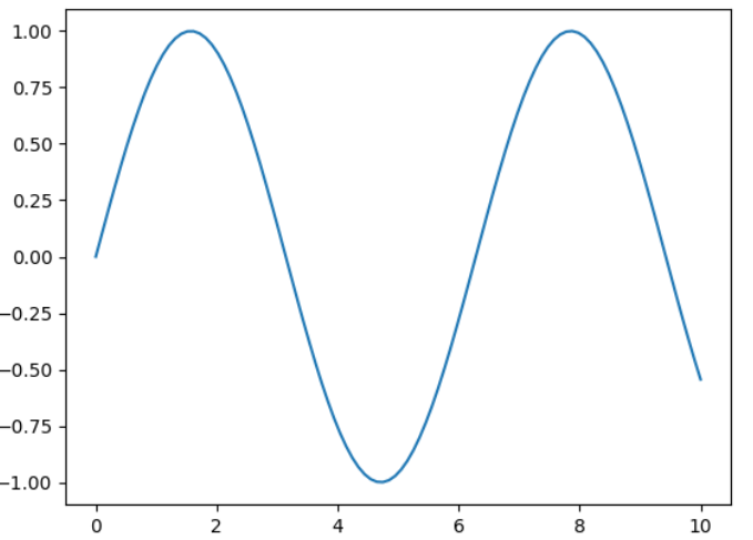
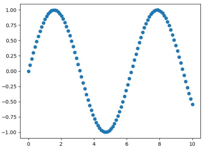
Matplotlib数据可视化 Plot折线图 import matplotlib as mplimport matplotlib.pyplot as plt
x = np.linspace(0 ,10 ,100 )
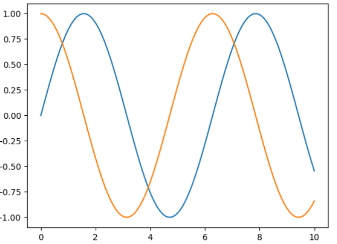
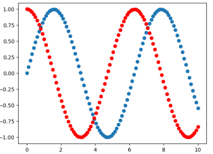
cosy = np.cos(x)
siny = y.copy()
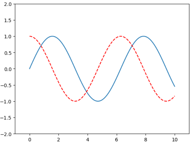
plt.plot(x,siny) plt.plot(x,cosy) plt.show()
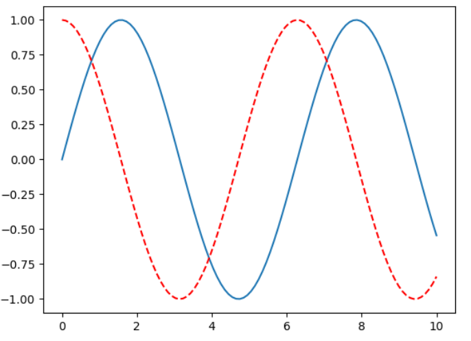
plt.plot(x,siny) plt.plot(x,cosy,color = "red" ,linestyle = "--" ) plt.show()
常用颜色 :’b’ 蓝色,’m’ 洋红色,’g’ 绿色,’y’ 黄色,’r’ 红色,’k’ 黑色,’w’ 白色,’c’ 青绿色,’#008000’ RGB 颜色符串。多条曲线不指定颜色时,会自动选择不同颜色。
线型参数: ‘‐’ 实线,’‐‐’ 破折线,’‐.’ 点划线,’:’ 虚线。
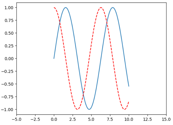
plt.plot(x,siny) plt.plot(x,cosy,color = "red" ,linestyle = "--" ) plt.xlim(-5 ,15 ) plt.show()
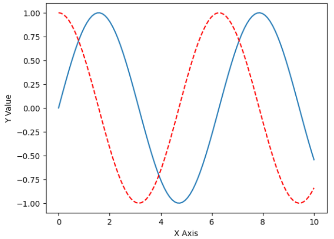
plt.plot(x,siny) plt.plot(x,cosy,color = "red" ,linestyle = "--" ) plt.axis([-1 ,11 ,-2 ,2 ]) plt.show()
plt.plot(x,siny) plt.plot(x,cosy,color = "red" ,linestyle = "--" ) plt.xlabel("X Axis" ) plt.ylabel("Y Value" ) plt.show()
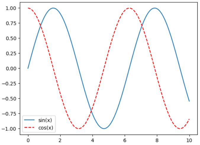
plt.plot(x, siny, label="sin(x)" ) plt.plot(x, cosy, color = "red" ,linestyle = "--" ,label="cos(x)" ) plt.legend() plt.show()
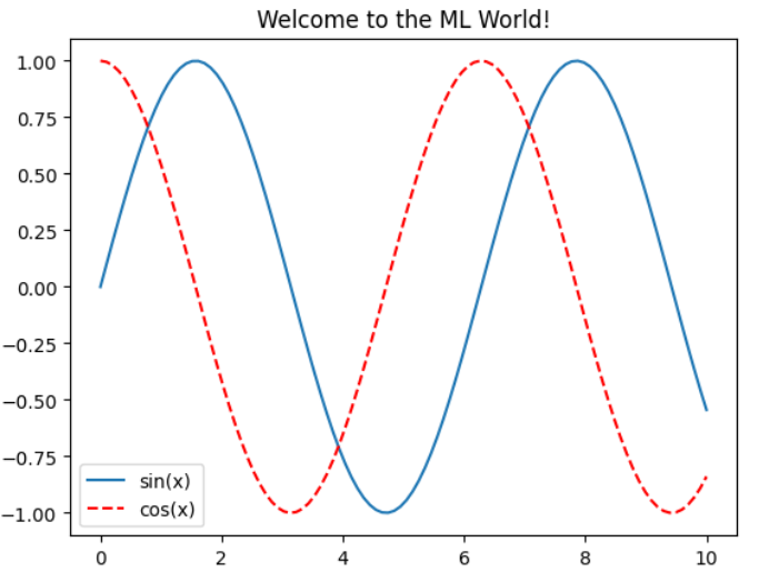
plt.plot(x, siny, label="sin(x)" ) plt.plot(x, cosy, color = "red" ,linestyle = "--" ,label="cos(x)" ) plt.legend() plt.title("Welcome to the ML World!" ) plt.show()
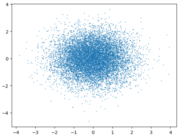
Scatter散点图 plt.scatter(x, siny) plt.show()
plt.scatter(x,siny) plt.scatter(x,cosy,color="red" ) plt.show()
x = np.random.normal(0 ,1 ,10000 ) y = np.random.normal(0 ,1 ,10000 ) plt.scatter(x, y, alpha=0.5 , s=1 ) plt.show()
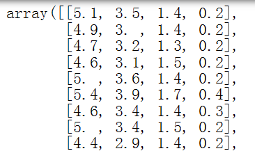
数据加载和简单的数据探索 import numpyimport matplotlib as mplimport matplotlib.pyplot as plt
from sklearn import datasets
iris = datasets.load_iris()
输出:dict_keys([‘data’, ‘target’, ‘frame’, ‘target_names’, ‘DESCR’, ‘feature_names’, ‘filename’, ‘data_module’])。
输出:[‘sepal length (cm)’,
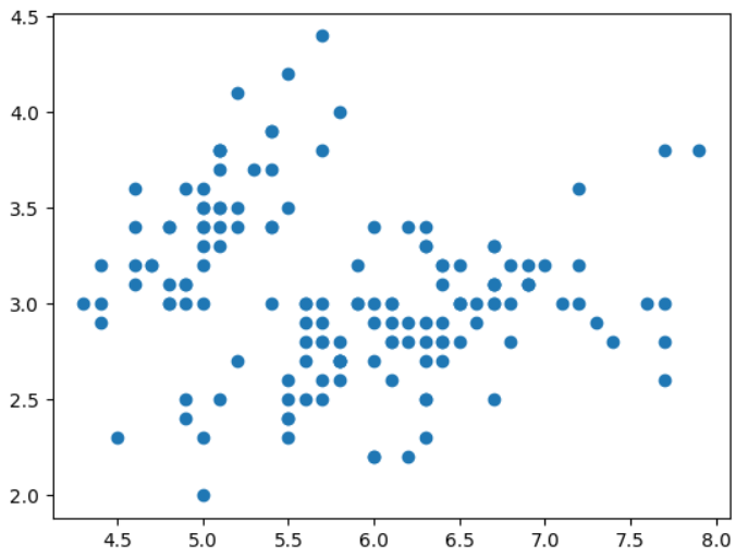
X = iris.data[:,:2 ] X.shape
plt.scatter(X[:,0 ],X[:,1 ]) plt.show()
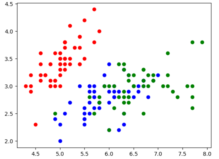
y = iris.target plt.scatter(X[y==0 ,0 ],X[y==0 ,1 ],color="red" ) plt.scatter(X[y==1 ,0 ],X[y==1 ,1 ],color="blue" ) plt.scatter(X[y==2 ,0 ],X[y==2 ,1 ],color="green" ) plt.show()
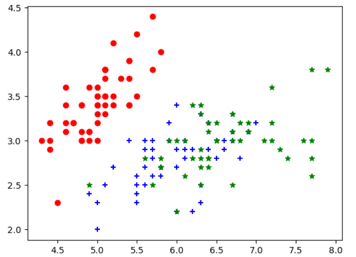
y = iris.target plt.scatter(X[y==0 ,0 ],X[y==0 ,1 ],color="red" ,marker="o" ) plt.scatter(X[y==1 ,0 ],X[y==1 ,1 ],color="blue" ,marker="+" ) plt.scatter(X[y==2 ,0 ],X[y==2 ,1 ],color="green" ,marker="*" ) plt.show()